
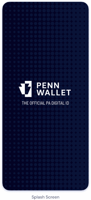
pennwallet
Analyzing the fallbacks of traditional physical licenses and designing for a secure, accessible, and tamper-proof digital alternative.
The Opportunity
Physical IDs pose many limitations, highlighting the need for a secure, convenient, and modern solution
Physical IDs are inconvenient, difficult to scan quickly for information, and susceptible to many problems: users risk losing their physical driver’s license or having it stolen; carrying a physical license can be inconvenient in situations where users have their phone but not their wallet; physical licenses can become damaged, making them unreadable; and physical licenses are prone to tampering and counterfeiting.
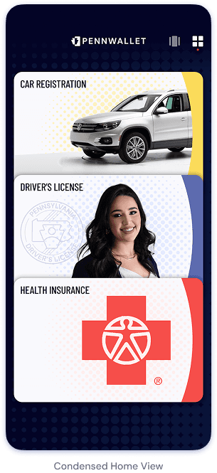
Create a secure and convenient mobile app that serves as a digital driver's license, addressing the risks and inefficiencies of physical licenses while enhancing user experience through security and integration with modern digital ecosystems. By modernizing the way users store and present their IDs, this solution streamlines verification processes, reduces dependency on physical cards, and enhances both security and convenience in everyday life.
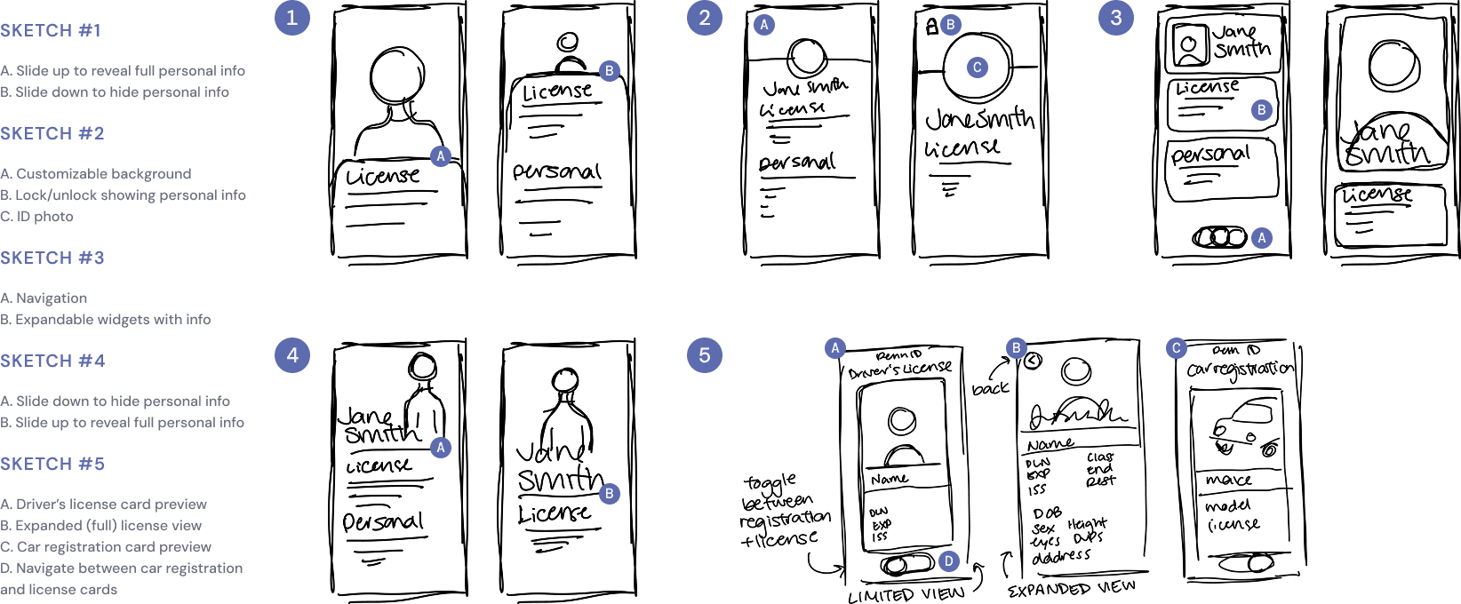
Sketches
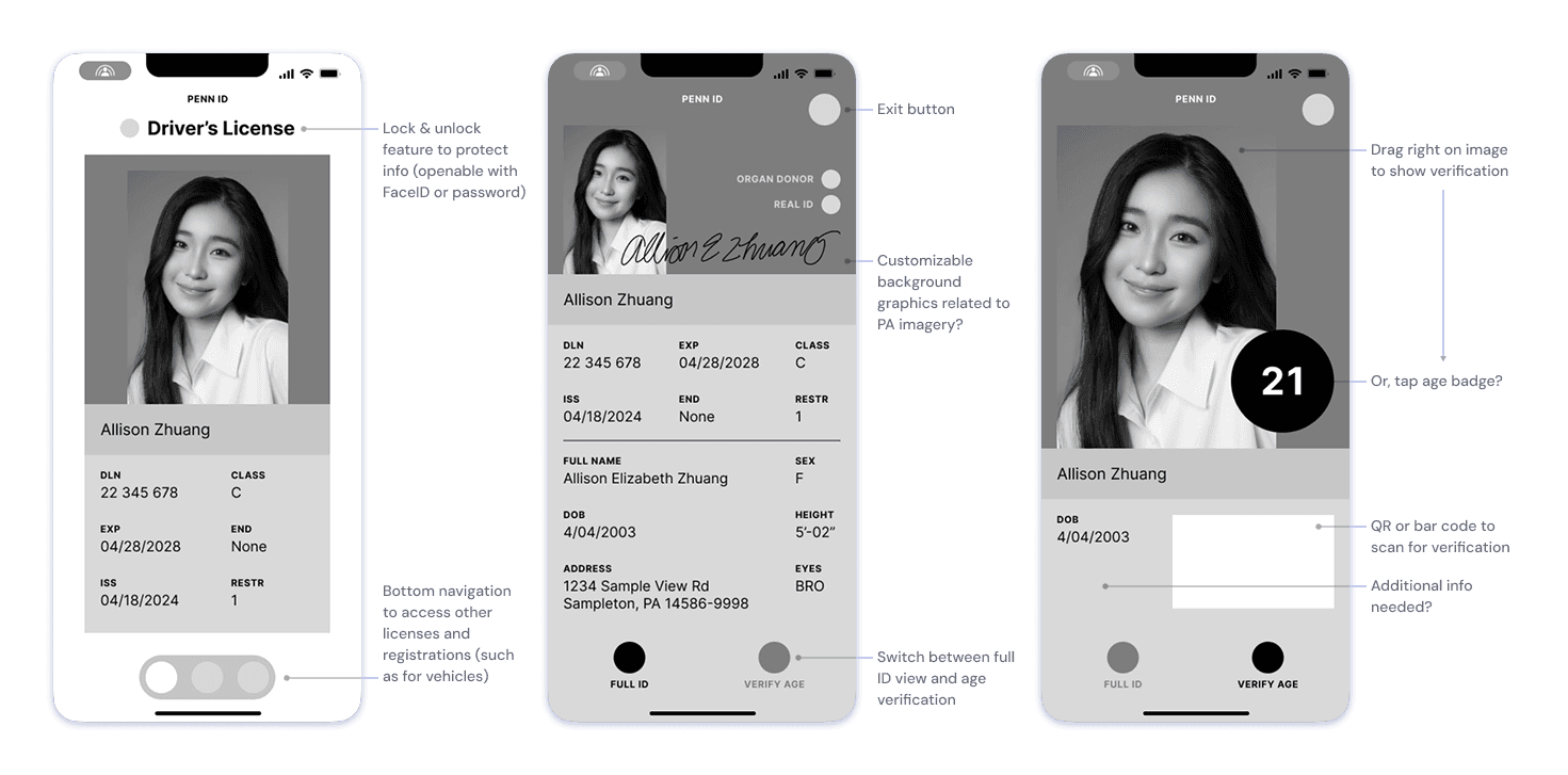
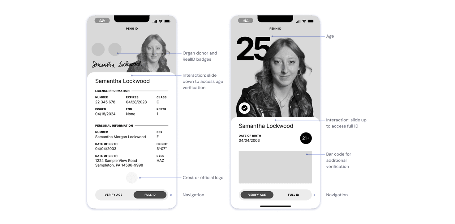
Wireframes
Visual Exploration
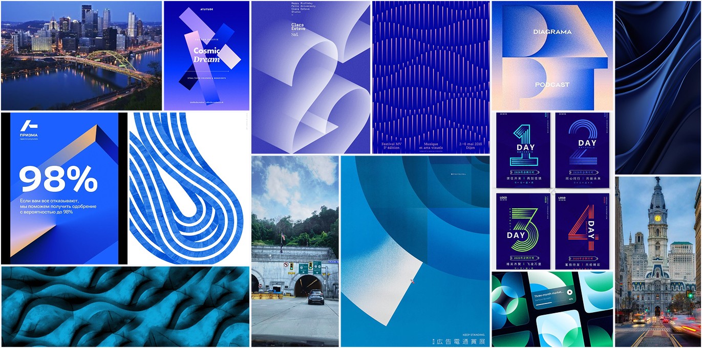
Azure Modern
This clean, modern, city-oriented aesthetic evokes a sense of urban sophistication and clarity. There is an emphasis on lines, minimalistic layouts, and a blend of negative space and geometric forms. The structured yet dynamic flow shows the energy and organization of city life. Key elements include focus on modern typography and subtle gradients that align with the aesthetic’s contemporary tone

Urban Glow
This bright, sharp, and modern aesthetic combines vibrant energy with precision and clarity. The design focuses on bold contrasts, angular shapes, and streamlined layouts. Orange accents add warmth and intensity, while the blue tones provide balance and professionalism. The overall vibe is striking and contemporary, evoking innovation, forward momentum, and a crisp urban edge.
WIP Reflection
What was working?
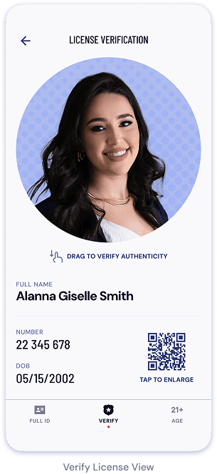
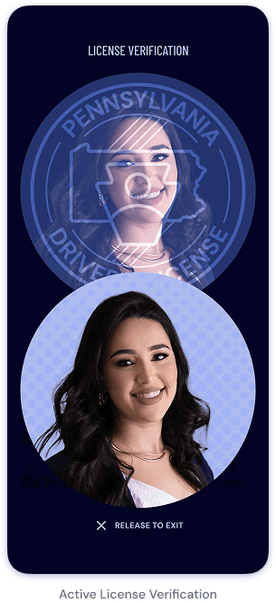
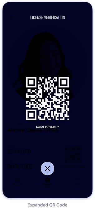
The base idea for my design as a digital wallet still holds strong as a concept. Throughout iterations, my navigation elements improved from confusing to conventional. Also, my typography steadily improved (although it still needs some work). Additionally, the drag-to-verify feature on the License Verification screens proved a creative and effective solution to an authenticity problem.
What needed improvement?
Despite attempting to pursue a visual direction inspired by the beautiful rolling hills of rural PA, the execution turned childish and unprofessional, straying from the original values I want to embody with my design. While the compositions and wireframes have a decent foundation, the visual display needs a better foundation in strongly and clearly defined branding.
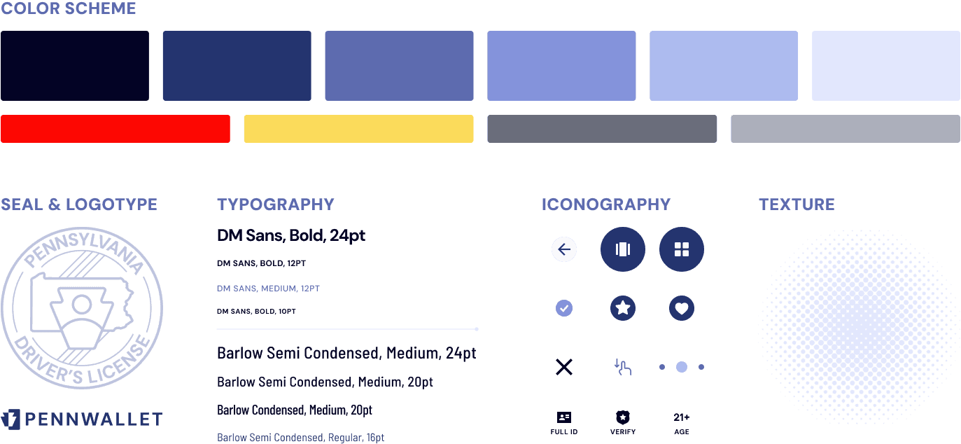
Branding
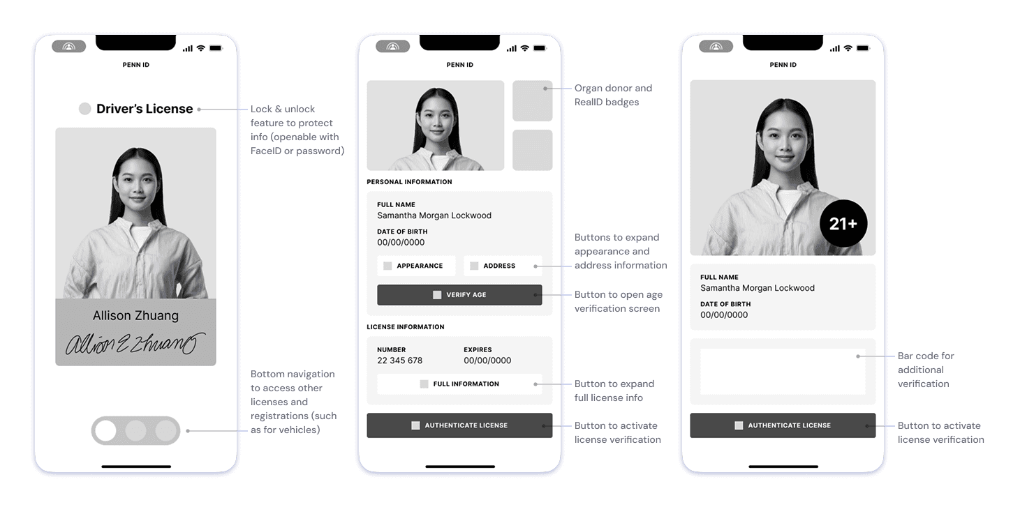
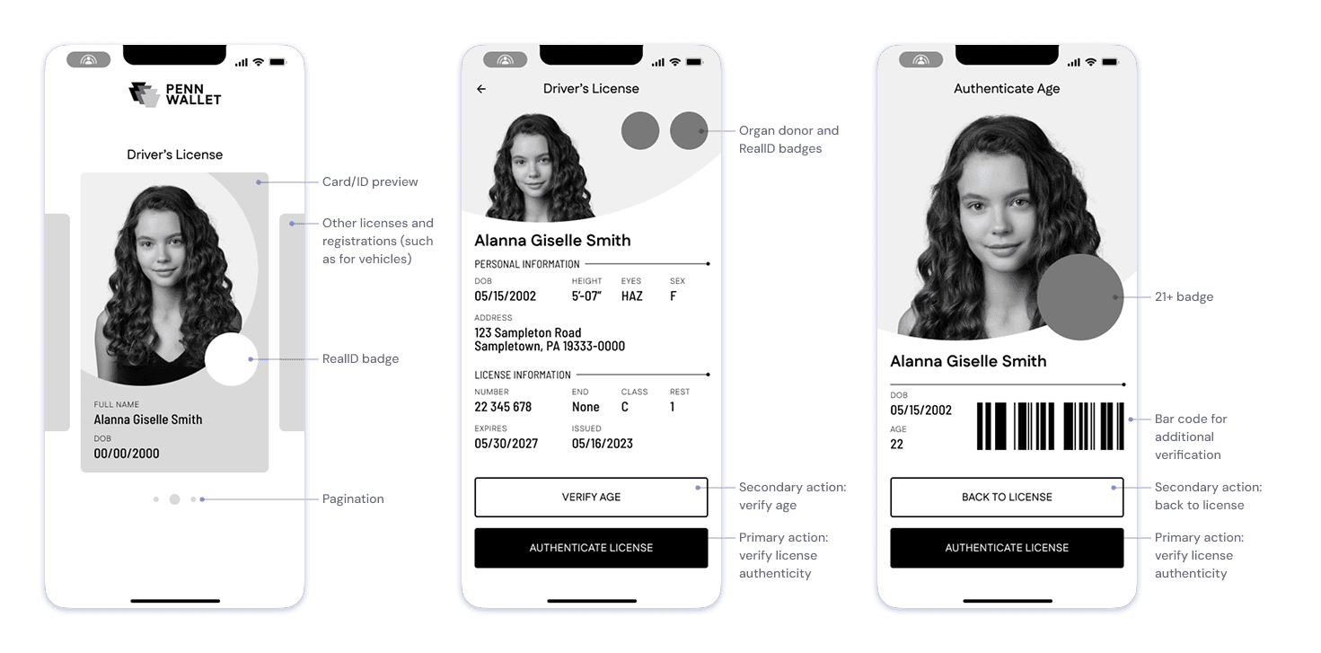
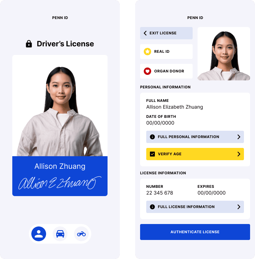
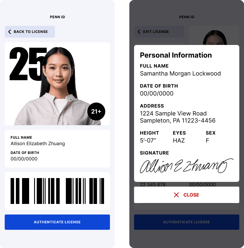
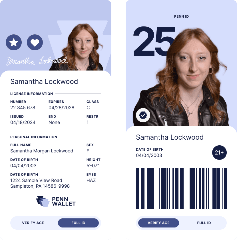
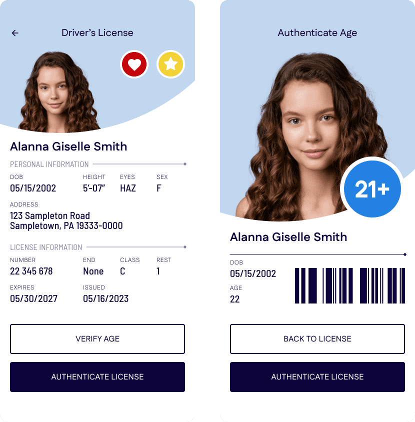
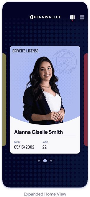
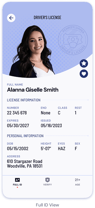
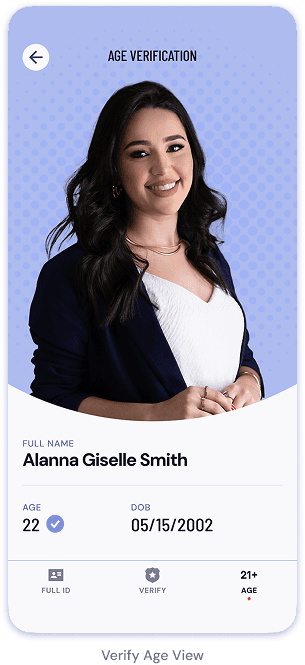
Final UI
The Conclusion
Design is not linear; rarely does one go from point A to point B without taking a few wrong turns
I found that the more effort one puts into the beginning stages of a project, the more successful the outcome. By dedicating myself to finding solid research on existing products, as well as making numerous sketches and wireframe options, I gave myself many points to reference as I developed my project and to fall back on when I had to backtrack.
During this project, I came to terms that I would develop an idea, only for it to fail to meet my expectations. Sometimes, I would backtrack on the visual development. More often, however, I would return to the drawing board and start from scratch with fresh sketches and new wireframes. With each iteration, I was able to reflect on the shortcomings of my previous designs and look for solutions to incorporate in my new ones.